Final Project Spring 2018
I have always had a fascination for language and how it influences the world around us. When researching what to do for my final project I knew that I had to do something related to that idea. Being a German speaker in the United States, I wondered how my situation compared to the world around me. After ding much research I came up with some data to put into my visualization. After questing the internet to find a data set I came across a 2016 American Community Survey of the amount of languages spoken by people in the United States. While this data was impressive, I wanted something else to compare it to to get more of my point across. Getting data for how many people speak a certain language around the world was not as easy. I eventually found a data set from Ethnologue of data from over 7,000 languages. I decided to just stick to the top 20 languages for both the United States and the World population.


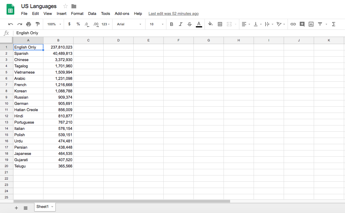
Here are the two datasets

The next step was to decide what visualization it would be. I decided to choose the distribution, bar graph design. This gave the best visualization since the numbers were so large. I also took the design properties I learned in this class of using bright yet not too harsh colors to attract the eyes of the user


By having this visualization, I believe it shines a light on how the world is not so different. We, as English speakers, are not the only ones in this world. There are people that outnumber us by far and we have to embrace that fact. I feel that people should take the time to learn another language and get to know their own culture. Being bilingual is obviously not that common here in America and that should definitely change. To see that 237 million people only speak English is absurd and I hope with this visualization that it can help one see that something needs to be done.

Comments
Post a Comment